Old signs, forgotten stories
The historical meaning behind advertising can drive collectors
Miller & Miller’s December 7th and 8th auction weekend features an array of historic advertising signs and displays.
Ask a collector why he or she collects old advertising signs, and you’ll get a million answers. Many collectors see signs as works of art that should be hung like Picassos. The colours ‘pop’, the balance pleases, and the shape of the script motivates. Others love the physical characteristics, like the heavy weight of an early porcelain sign, with its smooth, glossy surface and graduated layers of enamel (shelving). Some collectors enjoy the irony and humour of the subject matter - like the Buckingham Cigarettes ‘throat easy’ claim (a claim Philip Morris was eventually forced to drop). However, nothing is more powerful than the story each sign tells. At Miller & Miller’s December 7th and 8th Petroliana and Advertising auctions, there are many stories to tell.
At first glance, this obscure Chero Crush Syrup Dispenser (lot 487) would seem to have little connection with a brand many of us would recognize today. But during soda’s golden age it represented the ambition and ingenuity of American pharmacist-turned-grocer Claud Hatcher, and his battle with soft drink behemoth Coca-Cola. This porcelain dispenser once held an important syrup called “Chero Crush”, which was mixed with seltzer water to make a cherry soda. In 1903, Hatcher left his successful pharmacy career to join his family’s wholesale grocery business, but that venture soon led to a dispute between him and The Coca-Cola Company over pricing. Hatcher was enraged and decided to employ his pharmaceutical ‘mixology’ background to concoct his own soft drink. He launched Union Bottling Works in the basement of his grocery store and in 1907 introduced Chero-Cola, a direct ‘punch’ in the face to Coca-Cola. Hatcher’s company would later become the Royal Crown Cola Company, one of Coca-Cola’s major competitors. Today, only a few of Hatcher’s original dispensers remain, making this an important symbol of an historical battle.
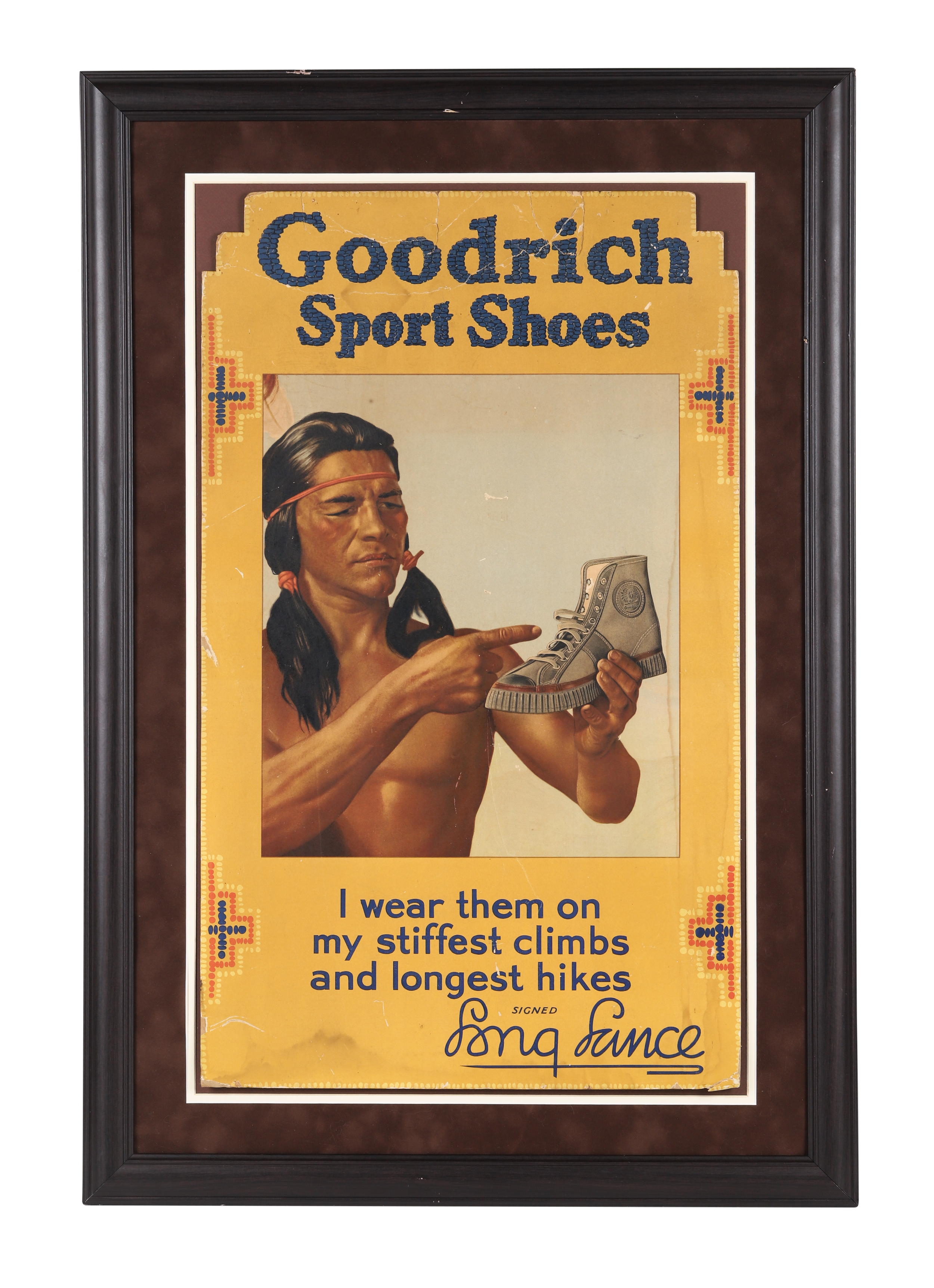
The Goodrich Sport Shoes "Chief Long Lance" Sign (lot 565) tells an interesting story too. Few people know that, thanks to its various rubber patents, B.F. Goodrich (the tire company) was actually one of America’s original sneaker brands. However, the true intrigue lies in the man the company chose to endorse its sneakers. ‘Chief Buffalo Child Long Lance’ was born Sylvester Clark Long, a mixed race African-American. Sadly, to escape the societal stigma associated with his African American roots, he spent his life masquerading as a Native American. He achieved incredible success as an actor, writer, public figure, and champion of the Native American culture that was not his own. Ultimately, his internal conflict over his racial identity led him to take his own life.
While B.F. Goodrich fought to pay Chief Long Lance for his endorsement of its sports shoes, other companies piggy-backed on public influencers for free. Although the John Ruskin Cigars Sign (Lot 479) appears to be an endorsement by the renowned British writer and critic, Ruskin never approved the endorsement and was actually a staunch opponent of smoking, calling it a “corrupter of youth morals.” Clearly Ruskin has more than "smoke and mirrors" to say about that marketing campaign!
Another endorsement likely unauthorized by its subject is the eye-catching Black Cat Cigarettes Sign (Lot 468). In fact, Black Cat, one of the most successful brand mascots of all time, was developed entirely by accident. In 1904, Carreras Ltd. owned a shop in the United Kingdom where a prominent black cat used to sleep in the window. Since the name "Carreras" was hard to pronounce, locals began calling it the “black cat shop” and then the firm decided to adopt the name. About a decade after the company expanded to Canada in the 1930s, it commissioned St. Thomas Metal Signs (St. Thomas, Ontario) to produce a run of iconic signs, including this one. Unbeknownst to the cat in the window, it is considered one of the most sought-after signs in Canadian advertising.
There is no question that with lot 485, the Tucketts Marguerite Cigar Sign, The Tuckett Tobacco Company was trying to demonstrate the quality of its product through this sign. Before the era of stock photos and digital graphics, advertisers turned to skilled artists to hand-render eye-catching visuals to sell products. The male-dominated cigar audience of the era was undoubtedly drawn to this elegant portrait of ‘Marguerite’ painted by Italian artist Angelo Asti, also known as the father of pin-up art. George Tuckett (1835-1900) was a self-made tobacco mogul who built a successful Canadian empire, known for his innovation, perseverance, and progressive labor practices. To learn more about Tuckett, read our Miller Times story here.
Advertisers have always used ingenuity and cleverness to generate attention and J.M. Fortier’s Noisy Boys Cigars Reverse Glass Sign (lot 566) is a great example. The brand “Noisy Boys” was meant as a nod to the crackling sound fine cigars make when drawn. However, this sound didn’t leave much in the way of imagery for a sign, so the advertisers changed the meaning. Instead, they depicted the “Noisy Boys” in another way: a young boy causing a ruckus with a drum and horn. Advertisers had even more fun with the name, depicting a schoolmaster scolding a classroom of insolent students, all depicted as well known Canadian politicians of the era.
"Noisy boys" is also the subject matter of one of the most sought-after cigar box lithographs among collectors. Originally based on a comical lithograph by Heffron & Phelps in New York, J.M. Fortier adapted the image to feature a schoolmaster scolding Canadian politicians involved in the scandals of the time, particularly during Prime Minister Sir John A. Macdonald's terms. The image features Macdonald, Sir Edward Dewdney, Sir Alexander Mackenzie, and Sir Hector Langevin.
Historic advertising can also be visual evidence of societal change. Lot 558, a rare 1907 advertising calendar from The McLaughlin Carriage Co. of Oshawa Ontario, illustrates such change. It represents the company’s transition from carriage maker to motorcar manufacturer. In 1867, Robert McLaughlin made the company famous with his patented "McLaughlin Gear" undercarriage for horse-drawn buggies. But he resisted the automobile. He even went as far as to create “anti-motorcar" ads such as the 1906 calendar below.
This 1906 calendar by The McLaughlin Carriage Co. reflects Robert McLaughlin’s anti-car sentiment, depicting a McLaughlin carriage cheerfully passing a wrecked automobile surrounded by injured passengers.
The 1906 calendar includes a poem which reads:
An automobile of the latest design,
Its use I will never disparage,
But for comfort and pleasure, pray give me for mine,
A McLaughlin Reliable Carriage.
However, by 1907, the featured calendar (lot 558) exalts the virtues of the McLaughlin-Buick ‘Model Seventeen’ motorcar. It represents the important turning point when McLaughlin’s sons embraced the automobile, which paved the way for the McLaughlin-Buick empire.
As McLaughlin began to embrace the automobile, the poem on the 1907 calendar took on a different tone:
The sun was shining brightly on a summer day in June,
When this happy wedded couple started on their honeymoon;
And a very cogent reason for their happiness is seen,
For they both begin their journey in a Model ‘Seventeen.’
It is thus in every journey-nothing ill can e’er befall
While ‘McLaughlin-Buick'‘ motor cars bring happiness to all.
Today, buzzwords like "small batch," "artisan-made," "hand-crafted," and "micro-brewed" are synonymous with high-quality products. In contrast, during the early 1900s, the focus was on promoting safety and consistency as key selling points. Case in point, the Ontario Brewing and Malting Company framed chromolithograph (Lot 362). The efficiency and consistency achieved through mass production were transformative at the time. It also made products like beer more affordable. While factories today are often seen as polluters, they were once viewed as beacons of prosperity and hope—symbols of strength rather than weakness in the eyes of consumers. This lithograph glorifies the operational “muscle” behind the product, featuring the vast malt house and brewery of the Ontario Brewing and Malting Company in Toronto.
Some historic advertisements were made to tell a story. The Hudson's Bay Tri-Fold Tobacco Display Sign (lot 486) reflects the company’s role in Canada's early tobacco trade. The center panel highlights Hudson’s Bay’s "famous tobaccos," traded with the Indigenous peoples for beaver pelts. The right panel commemorates the company’s 1670 founding, when it was granted exclusive trading rights by King Charles II. The left panel showcases “Fort Garry” tobacco and an image of Indigenous inhabitants near the historic Fort Garry trading post. This is an extremely rare display that tells the story of Canada’s most historically significant company.
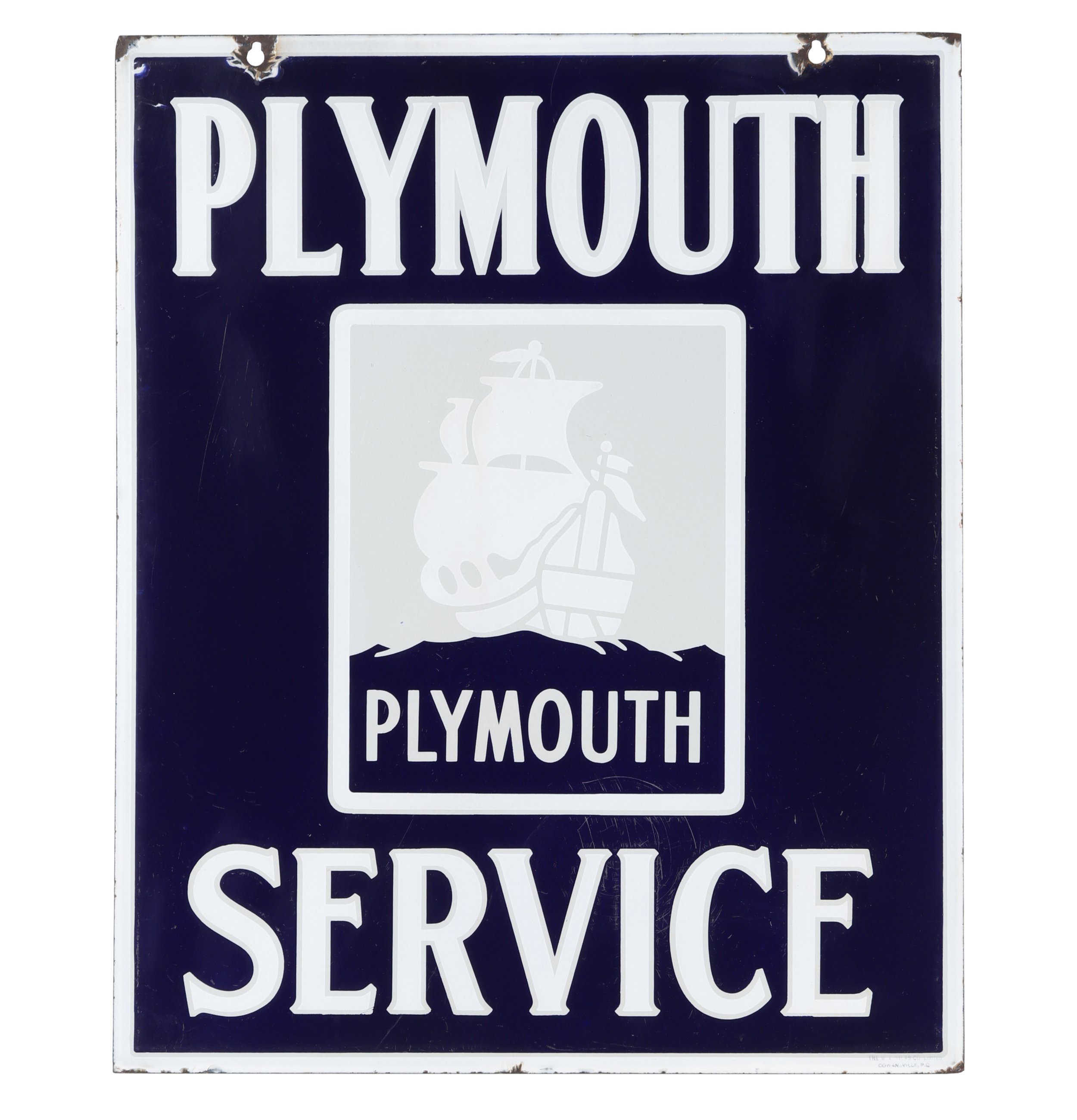
Two other story-telling signs in the December 7th and 8th auctions share two key features: they are both porcelain, and they both feature ships. The circa 1900 Puritan Cut Plug Tobacco Sign (lot 466) featuring a ship at sea symbolizes the Puritans' migration to Massachusetts Bay. The Puritans were a group of 16th-century English Protestants that sought freedom from the Church of England. The sign was issued by the D. Ritchie & Co. of Montreal, one of two Canadian companies that eventually formed Canada’s largest tobacco company: Imperial Tobacco. Lot 269, the Plymouth Dealer sign, floats another tale. Chrysler Corporation launched Plymouth in 1928 to compete with the ‘low priced’ market segment alongside Chevrolet and Ford. The sign features a logo depicting the mayflower; a ship which landed at Plymouth Rock in Plymouth Massachusetts (hence the name). It is marked by the maker, Vilas Enamel Products, Cowansville, Quebec.
Collectors of old advertising signs have many reasons for their passion. Signs are now collected as works of art and prices paid for them are rivalling those paid in the fine art market. Collectors are drawn to old signs for the way they were made, the materials they were made from, and the messages they convey. The greatest signs tell the greatest stories, and the greatest collectors know just how to tell them.
Story by Tess Malloy
Tess is a freelance writer and history enthusiast who enjoys unearthing interesting stories about remarkable people and objects. Tess has written for The Miller Times for six years.
Sale Details:
December 7 & 8, 2024
Petroliana & Soda Advertising | Advertising & Historic Objects
Did you enjoy this article? Share it using the buttons below:


